Guide to Reading a Gold Cost Chart
The Mintly Team
December 27, 2023Gold, since historic times, has been a symbol of wealth and prosperity. Today, it continues to be a popular investment choice worldwide. Understanding the gold cost chart is crucial to making informed trading decisions. Here’s a comprehensive guide to help you decipher the complexities of the gold cost chart.
Understanding the Gold Cost Chart Basics
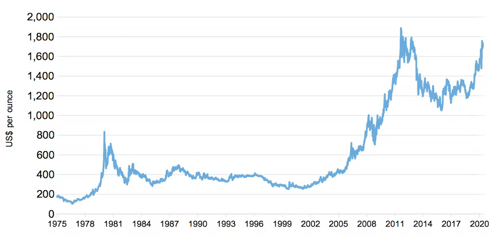
The gold cost chart is a crucial tool for investors and traders in the precious metal market. It provides valuable insights into the price movements of gold over a specific period. By analyzing the chart, investors can make informed decisions about buying or selling gold.
The gold cost chart typically displays the price of gold on the vertical axis, while the horizontal axis represents time. It may include various timeframes, such as daily, weekly, monthly, or even yearly data. Each data point on the chart represents the closing price of gold for that particular period.
One of the key elements of the gold cost chart is the trend lines. Trend lines help identify the overall direction of the gold price. An upward trend indicates a bullish market, while a downward trend suggests a bearish market. Traders often use trend lines to determine potential entry or exit points.
Another important feature of the gold cost chart is support and resistance levels. These levels represent price levels at which gold tends to bounce back or encounter selling pressure. Traders use support and resistance levels to set stop-loss orders or take-profit targets.
Moreover, technical indicators like moving averages, relative strength index (RSI), and stochastic oscillators are commonly used in conjunction with the gold cost chart. These indicators provide additional signals and confirmations to traders.
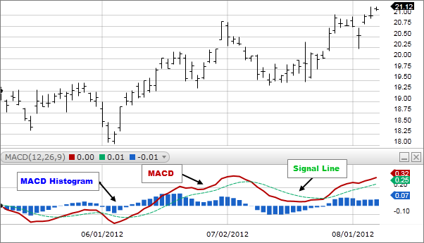
Reading Candlestick Charts
Candlestick charts are a popular tool used by traders and investors to analyze the price movement of financial assets, such as stocks, currencies, and commodities. These charts provide valuable insights into the market sentiment and can help identify potential trends and reversals.
A candlestick is formed by four main components: the open, close, high, and low prices. Each candlestick represents a specific time period, such as a day or an hour. The body of the candlestick is formed by the open and close prices, while the wicks or shadows represent the high and low prices.
The color of the candlestick is determined by whether the closing price is higher or lower than the opening price. A bullish candlestick is typically green or white, indicating that the closing price is higher than the opening price. Conversely, a bearish candlestick is usually red or black, indicating that the closing price is lower than the opening price.
The length of the body and the wicks can provide valuable information about the strength of the price movement. Long bodies indicate significant price changes, while short bodies suggest less volatility. Similarly, long wicks indicate price rejection at higher or lower levels, while short wicks suggest strong buying or selling pressure.
Traders often look for specific candlestick patterns to make trading decisions. For example, a doji candlestick, where the open and close prices are very close or equal, suggests indecision in the market. Other patterns, such as engulfing patterns or hammers, can signal potential trend reversals.
Understanding Volume and Moving Averages
When analyzing the gold cost chart, two important technical indicators to consider are volume and moving averages. These tools provide valuable insights into market trends and can help investors make informed decisions.
Volume refers to the number of shares or contracts traded during a given period. In the context of the gold market, it represents the number of ounces of gold bought or sold. High volume typically indicates strong investor interest and can be a sign of a significant price movement. Conversely, low volume suggests a lack of interest or uncertainty in the market.
Moving averages are used to smooth out price fluctuations and identify trends. The most common types of moving averages are the simple moving average (SMA) and the exponential moving average (EMA). The SMA calculates the average price over a specified period, while the EMA places more weight on recent data points. Traders often use moving averages to identify support and resistance levels and determine entry and exit points.
By combining volume analysis with moving averages, traders can gain a better understanding of market dynamics. For example, a rising gold rate accompanied by high volume suggests strong buying pressure and a potential uptrend. Conversely, a declining price with increasing volume may indicate selling pressure and a possible downtrend.
It’s important to note that these indicators are not foolproof and should be used in conjunction with other analysis techniques. Additionally, individual preferences and trading strategies may influence the choice of specific moving averages or volume parameters.
Interpreting Patterns and Indicators of Gold Cost Chart
Interpreting patterns and indicators on a gold cost chart is a crucial skill for investors and traders alike. The gold market is influenced by a variety of factors, including economic conditions, geopolitical events, and investor sentiment. By analyzing patterns and indicators on a gold cost chart, market participants can gain insights into the future direction of gold prices.
One commonly used pattern is the trendline. A trendline is drawn by connecting the highs or lows of a series of price points. It provides a visual representation of the overall direction of the market. An upward trendline suggests bullishness, while a downward trendline indicates bearishness. Traders often look for breakouts or reversals when the price crosses the trendline.
Another important indicator is the moving average. The moving average smooths out price fluctuations and helps identify the underlying trend. The 50-day and 200-day moving averages are commonly used by traders to determine the short-term and long-term trends, respectively. When the shorter-term moving average crosses above the longer-term moving average, it is considered a bullish signal, and vice versa.
Additionally, chart patterns such as head and shoulders, double tops, and triangles can provide valuable insights into potential price movements. These patterns form as a result of supply and demand dynamics in the market and can indicate trend reversals or continuations.
Gold cost charts often form patterns that traders use to predict future movements. For instance, an “ascending triangle” pattern can suggest an upcoming bullish breakout. On the other hand, a “head and shoulders” pattern might indicate a bearish reversal.
Moreover, traders use various indicators alongside the gold cost chart to make more accurate predictions. These include Relative Strength Index (RSI), Moving Average Convergence Divergence (MACD), and Bollinger Bands. These indicators can help identify overbought or oversold conditions and potential reversals.
The Influence of Global Events
It’s essential to note that global economic events can significantly impact gold prices. For instance, during periods of economic uncertainty or geopolitical tension, investors often flock to gold as a “safe haven” asset, pushing its price up.
Conversely, when economies are doing well, and risk sentiment is high, gold prices may fall as investors move towards riskier assets like stocks. Therefore, staying informed about global events is crucial when interpreting the gold cost chart.
Conclusion
Reading a gold cost chart can seem daunting at first. However, with an understanding of the basic elements like price, volume, patterns, and indicators, it becomes an insightful tool for predicting price trends and making informed trading decisions. Remember that while charts and technical analysis are helpful, they are not foolproof. Always consider multiple factors, including global economic events, before making your investment decisions.
By mastering the art of reading a gold cost chart, you will not only enhance your trading strategy but also increase your potential for profitable investments in the gold market. Happy trading!
All Tags
Loading...
Loading...